Pawfy is a fast-growing pet wellness brand with a strong repeat customer base and a product line trusted by thousands of pet owners. Their advertorial had been running for over two years with minimal updates, which meant the design, messaging, and overall buying experience no longer reflected best practices in direct-response performance. I was brought in to redesign the advertorial, elevate the storytelling, and introduce modern CRO principles to improve engagement and drive more buyers into the funnel.
Services:
Advertorial
Project Outcome:
A redesigned, conversion-optimized advertorial that modernizes the brand’s story, improves readability, and creates a clearer, more persuasive path to purchase.
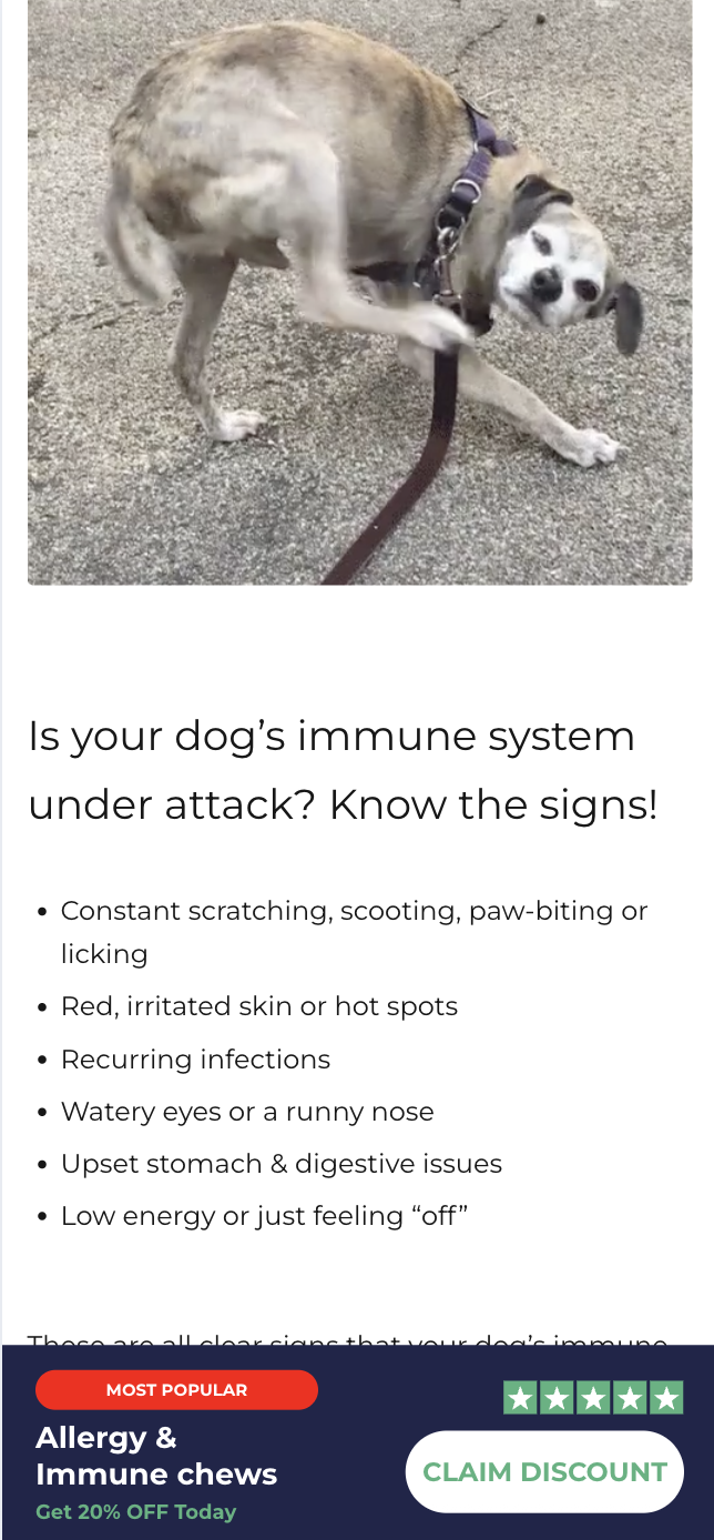
Pawfy’s previous advertorial had been live for more than two years with little iteration. While traffic remained strong, the user experience showed significant opportunities for improvement:
• The layout felt outdated and lacked clear hierarchy
• Storytelling did not connect tightly enough to pet owners’ real needs and pain points
• Product benefits were not showcased in a way that built urgency or emotional resonance
• Buying cues were subtle or buried within long sections of text
• There was no consistent strategy around calls to action or visibility of the purchase opportunity
In short, the advertorial was generating sales, but not at the level it could. Pawfy needed a refreshed, modernized buying experience that would feel relatable, trustworthy, and optimized for performance.
I redesigned the full advertorial with a focus on clarity, story structure, and conversion flow. The goal was to maintain the feel of editorial content while building a more persuasive and intuitive buying experience.
Key improvements included:
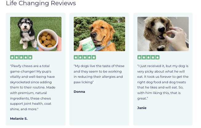
I reframed the narrative to focus on real pet owners’ concerns and the emotional motivations behind seeking supplements. The revised messaging addressed pain points directly and showcased the product's benefits in a way that felt both educational and trustworthy.
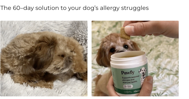
Updated visuals were chosen to reflect pets’ needs, emotional connection, and real-life outcomes, strengthening both credibility and relatability.
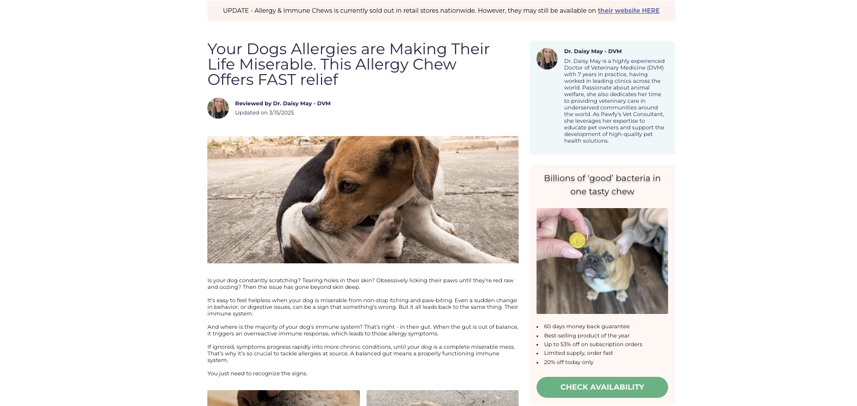
Sections were re-ordered and rebuilt to create a smoother flow, helping readers move naturally from awareness to interest to purchase. The new design emphasized scannability, clarity, and moment-to-moment persuasion.
I refined the placement and visibility of CTAs, making them easier to notice without overpowering the editorial tone. I also suggested and designed CRO enhancements such as:
• A sticky CTA
• Popup prompts
• A more intentional announcement bar
• Improved product offer presentation
• Refined pricing and benefit hierarchy
These changes created more consistent opportunities for users to convert at the moment they feel most motivated.
In addition to the redesign, I provided a prioritized list of CRO test ideas to continue performance improvements, including variant layouts, alternative headlines, new benefit blocks, and optimized above-the-fold storytelling.