Wildhawk is an innovative men’s underwear brand designed for guys who experience everyday drips and dribbles — a problem that is far more common than most are willing to admit. Their mission is to create a dignified, discreet solution that keeps men dry, comfortable, and confident without resorting to medical incontinence products or uncomfortable DIY fixes.
Wildhawk approached me to evaluate their main product detail pages (PDPs) through a CRO Roast, with a focus on strengthening mobile performance, clarifying their value proposition, and improving the conversion flow for paid traffic.
Wildhawk needed a clearer, more persuasive PDP experience that spoke directly to their customer’s needs without triggering shame or discomfort. The goal was to refine their existing pages so paid traffic could understand the product’s purpose quickly, feel seen (not judged), and move confidently into purchase.
Services:
CRO Roast

Project Outcome:
A strengthened PDP structure that increases clarity, reduces friction, and better supports buyers who need reassurance, discretion, and proof before making a switch.
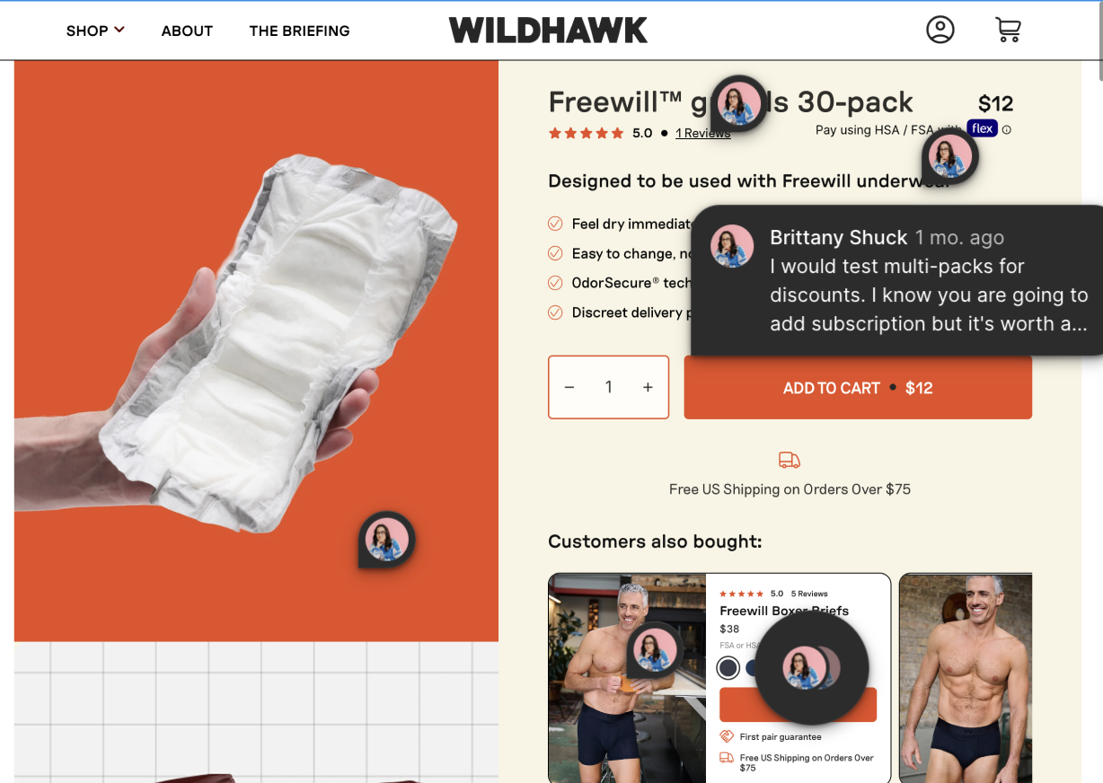
Wildhawk’s paid traffic heavily lands on the PDP, making it the most important point of conversion for the brand. However, several issues were limiting performance:
• The product’s core purpose wasn’t immediately clear
• Messaging didn’t directly address the emotional and functional realities of their audience
• Key benefits were buried or phrased in ways that softened the impact too much
• The mobile layout required excessive scrolling before users understood “why this product matters”
• Purchase-triggering information (absorption, odor control, comfort, discretion) wasn’t prioritized
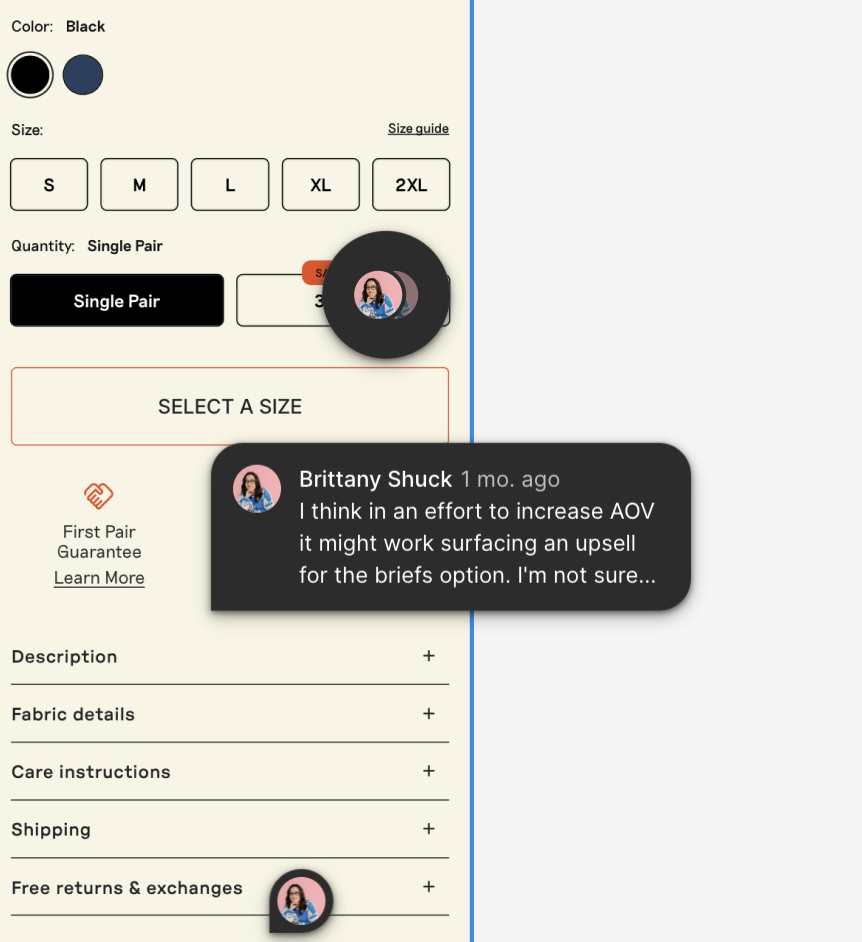
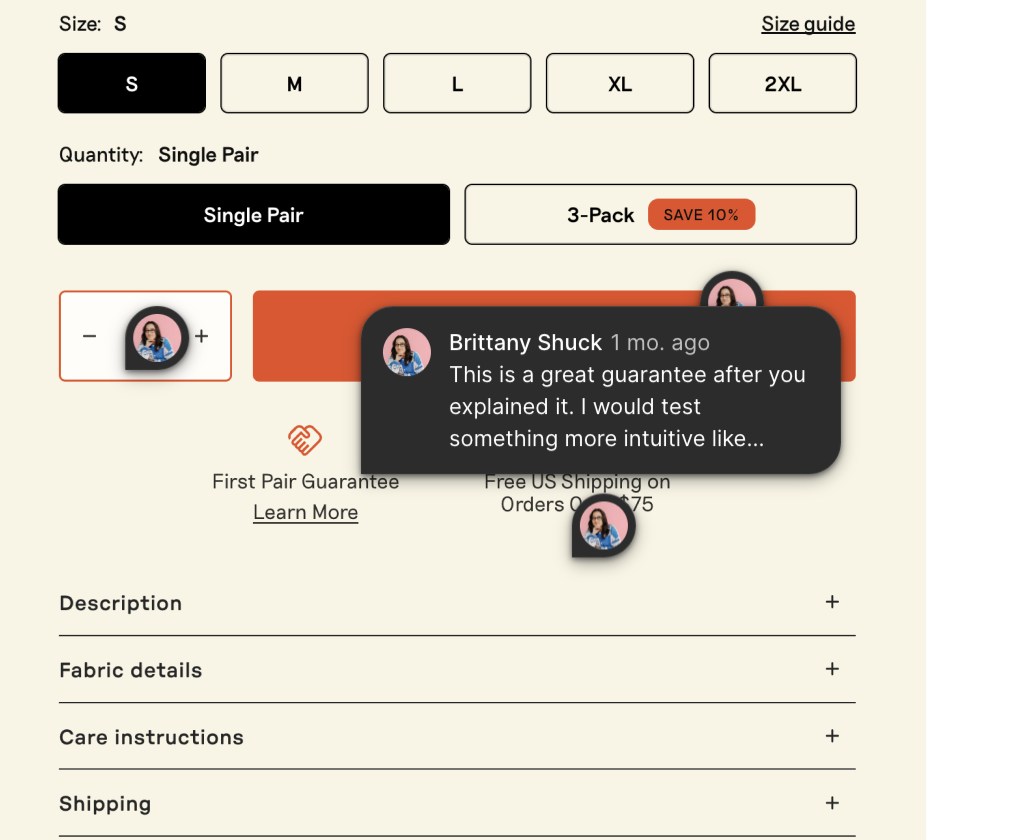
• Visual hierarchy didn’t guide the user toward the buy box or help them understand sizing and product differences
Because their customers often feel uncertainty, embarrassment, or confusion about their own needs, the PDP had to bridge that emotional gap — quickly.
I performed a comprehensive CRO Roast of Wildhawk’s main PDPs with a focus on friction removal, clarity, and pet peeve-proof mobile UX.
The audit included:
I restructured how Wildhawk presents their core benefit: discreet protection from drips and dribbles. This involved messaging that feels matter-of-fact, normalizing, and reassuring — without sensationalizing or minimizing the issue.
I recommended creating a direct narrative link between the pain points men experience and how Wildhawk solves them. This helps users self-identify and feel seen rather than sold to.
Key information such as absorption details, odor protection, comfort technology, and how the underwear works needed to appear earlier in the scroll to support faster decision-making.
I provided structural recommendations for improving size selection, variant clarity, and CTA placement so buyers can convert without unnecessary friction.
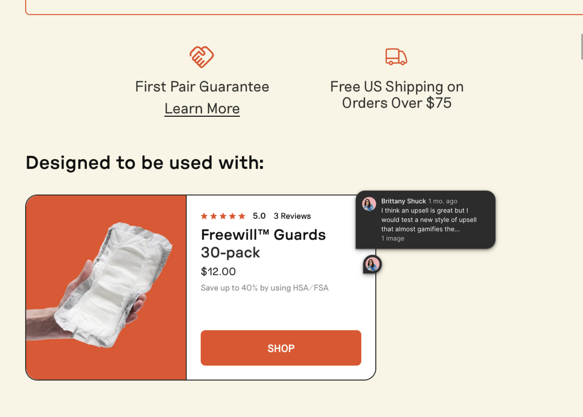
I identified opportunities to include more functional visuals, discreet education graphics, and subtle lifestyle imagery that feels real and relatable — not clinical or overly stylized.
To continue iterating, I provided suggested tests such as:
• Sticky CTA for mobile
• Announcement bar clarifying product purpose
• Revised benefit hierarchy
• Problem-first vs. feature-first messaging variants
• Stronger use of social proof and testimonials
• Functional imagery vs. lifestyle-first imagery variants
Each recommendation was paired with expert Figma comments detailing why the change mattered and how it ties back to conversion psychology for this specific audience.